 DVD Cover
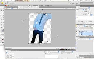
1. After taking multiple images we agreed on the best one to use for our design work. This is imported into a blank canvas. Using the magic wand tool as seen below, the image can be modified so that just a selection of the photo exists with the background removed. This allows the image to be layered on to another image and still look authentic.
 2. The image had to be rotated because the angle it was photographed at was not the desired angle.
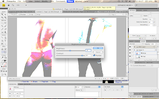
3. Step 1 and 2 was completed for both the front and back covers of the DVD insert and both images were pasted onto a net canvas of size 1600x1072 pixels as seen below. Auto colour level was first used on both images to accentuate their natural colours. I then adjusted the brightness and contrast of the images to give them an aesthetically pleasing and romanticised effect. The contrast was altered significantly while maintaining a relatively neutral brightness balance.
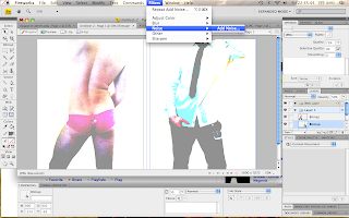
 4. After altering the hue, noise was then added to the images to take some of the natural skin tone out of them. This gives the effect that the model is less flawed.
5. A pink background was then inserted by altering the canvas colour. Pink was chosen because it reflects the sexual and somewhat feminine-appealing mood of the work. By reducing the opacity also, the images blend into the background with greater flow and consistency, as can be seen below.
6. After this the rest was a breeze. Film related logos were found off the internet, ‘magic-wanded’ and inserted onto the back cover of the DVD. Print screens from our music video were used to make the short storyboard on the back and the billing block was made using the Universal 39 Condensed font to add an authentic look. An age rating courtesy of the BBFC was also added along with a barcode to accentuate the DVD covers authenticity.
Magazine Advert
To create the magazine advert we did a photoshoot with me semi-naked in an attempt to create a professional looking model shot that we could use as the main focal point of our magazine advert. Again Macromedia Fireworks was used as the tool for the job and the sepia-style effect that we eventually settled on was created by experimentally adjusting the contrast, saturation, hue and brightness. The blur tool was also used softly on parts to accentuate certain features.
Original Unedited Finished Edited
After the image had been agreed on, the advertising features were placed over the top. The common theme throughout our advert and DVD cover is the brown/yellow strip across the bottom of both products and also the font style and placing of the headings as seen below.


No comments:
Post a Comment